Monday, 6 October 2008
BAD DESIGN
As notated in the picture , the swithces in living room, the variety of switches in the living room that lead to different connection can lead to confusion. Because there are 5 switches all in the same area, it is hard to know which switch does what.
Thursday, 25 September 2008
Postal presents - flower jewellry box


This is a flower jewellry box which can be folded so that it is much more handy to carry and use.
The jwellry box is flower shaped and divded into 5 spaces to seperate different kinds of jewellry.
My idea is based on folding flowers. I treid to keep the shape of the flowers as it is for woman while maintaing the strength of the box. To use it just open it up and press the middle hard with your fingers and stick the plastic in the hole to secrue th whole thing and to divde the space into 5.


Thursday, 18 September 2008
STORY OF STUFF - Annie Leonard
In this week's video, Annie Leonards shows us how whole design world is becoming more non- environmentlally friendly. She initially explains 5 steps of the linear system to show us how all the products we consume have bad influence for the environment. for example, polictics and supply demand in products could have a bad influence to the world we live in. Also we don't have enough resources and we watse too much. This reminded me how materials and resources are an important part of our every day life and also for our design process.
My opinion about design has changed by giving me an insight how the design of a product affects the world, and this linear cycle that we must develop to become a cyclic cycle. The problem with the cycle is that we are using up all our resources and destryong our earth. After watching this video, i realized that we should improve recycling and be more careful in material chosen when we are designing something.
My opinion about design has changed by giving me an insight how the design of a product affects the world, and this linear cycle that we must develop to become a cyclic cycle. The problem with the cycle is that we are using up all our resources and destryong our earth. After watching this video, i realized that we should improve recycling and be more careful in material chosen when we are designing something.
Thursday, 4 September 2008
We need many kind of ingredients to make food perfect including salt and pepper and sugar.
The old salt and pepper shakers were the glass bottle with metal cap types which looked boring and heavy. There was not much joy from using one.
My target is 20-30 aged woman who likes cooking and decorating the house.
She is someone who has a steady income and pretty rich.
 The 4 cone shakers can be used just by twisting the lid little bit and shake slightly.
The shape of the product is 4-cone shape connected together and a handle is adjusted by a pin so that it swings slightly and releases te ingredients from the shakers.
The colour is not too bright as the target market is a woman who has pretty much money.
This shakers is easy to hold and can contain different ingredients all at once and can use those at once. Aloso it can be used as a decoration for the kitchen.
The unique shape would bring a new 'thing' to the kitchen which would add some new colour to the table and would enrich the experience.
The unique shape would bring a new 'thing' to the kitchen which would add some new colour to the table and would enrich the experience.
Wednesday, 27 August 2008
Task 5: Reflection - Paul Bennett
Take home messages from the video would be that we should focus on the function and convenience of the product instead of focusing on the aesthetics of the design. Paul Bennett believes we shouldn’t design products to look good, but to do their job in the most .
The hospital is a good example which he showed how to improve the patient experience by lying in a bed. He emphasizes that it is not important to have new idea and to invent something new but it is more like development of the existing product.
From this video I’ve learned that products don’t have to be too pretty as long as it conveys the purpose of itself and I realized the importance of developing the existing product adding new ideas on the products with faulty rather than just designing new things.
Wednesday, 20 August 2008
TASK 5 : VIDEO REFLECTION - DESIGNING OBJECTS THAT TELLS STORIES
I think the major take home message for Yves Behar's video is the significance of values and meanings of the product and human involvement in the product.
At the begining of the video, he talks about his childhood memories and how it has contributed to his design. He believes we all have experiences with objects, so all the products around us incorporate to the human experiences. He desires to design "important stuff entire human experience not just the skin".
From this video i realized how it's important to design the products to involve the users and to create a connection between prodcut and consumer. I think rather than just designing aesthetic and fuctional product, we need to design something that involve human's experiences and memories so make users to think about the stories the object is trying to tell us.
Wednesday, 13 August 2008
Task 5 : Video Reflections – Organic Design
Before watching the video i spent most of my time getting ideas , deciding the way of production and choosing which material to use from researching on the internet or reading the books and magazines.. But After watching the video I realized the significance of getting inspiration from nature and using natural materials not from books or magazines.
In the video Ross Lovegrove spoke about the importance of nature in design. Most of the inspirations in his design process came from found materials in nature. Ross Lovegrove emphasizes the form from nature as well as organic materials he normally uses in his design showing the importance of looking into new materials which haven’t been used before. He also believes the forms with the essentials with no unnecessary parts are the best design.
From this video, i have learnt more about how the material and forms can have influence on people's soul and emotion. It also inspired me not to limit my choices of using new materials and forms to create different surprises.
Thursday, 7 August 2008
Task 5 : Video Reflections
After watching the video I realized not all aesthetic and fuctional products are good design but making designs ‘human centred’ is really important. David kelley is suggesting the importance of giving a personality and behaviour on the product. The video made me think that this basic concept of human-centred designs will need to be used in design on every products used by people everyday.
David comments about design being human centred and gives us good examples such as Prada store, change rooms, LCD doors, all in which designed in ‘human centred’. The concept of ‘human centered design’ gives us the idea that in which the communication process between object and person is important. Prada is the perfect example as it has turned the repetitive “same old same old” style of shopping into a shopping adventure.
The LCD mirrors allows the consumer to see what the products looks from the rear which ads another dimension to the experience of the consumer. Products such as the foot pedal to open the door is a great example of the communication process between object and person as it allows the user to use minimal strength to open the door which therefore means that it is more convenient and making it easier for humans. Product design such as the spy fish scuba dive has personality because it allows the human to scuba dive without being in the water.
After watching the videos I have come to the realization that when I am designing something I should not think of myself but the normal humans and incorporating the human centred themes in my design.
Wednesday, 6 August 2008
Task 2 : Good Design

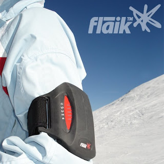
Snowsports Flaik
Designer : CMD Product Design and Innovation
Manufacturer : Snowsports Interactive
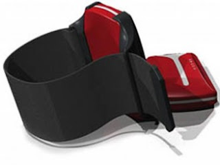
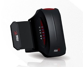
flaik is the world's first personal tracking device designed for skiers/snowboarders. Flaik tracks and records run by run performance and gives the riders the ability to monitor personal performance such as speed, distance, altitude and airtime. It is designed specifically for cold environments and it blends in well with current snow apparel. The eye catching red Flaik fits comfortably around the arm and attracts lots of attention. The rugged sports aesthetic and colour of the Flaik integrates very heavily into the already strong identity of the client, ‘Snowsports Interactive’. As the snow sports industry is highly fashion conscious, the Flaik was specifically designed to integrate with ski and snowboard apparel, while still fulfilling all design standards and needs for skiers and snowboarders alike.


Line : friendly, flowing lines with a curvy line to give the object smooth looking.
Shape : A simple smooth rectangular shape that looks modern
Pattern :the white component looks like a thermometer and the complements the white.
Texture : Smooth texture to allow comfort against the skin
Colour : The use of red and black to blend into skiers/snowboarders and the white thermometer shape makes it eye catching and fashionable.
Balance : The symmetrical design allows for the idea of balance.
Contrast : Red blending in with the white and the red against the black.
Proportion : The black case allows the fleik not to fall out and the black contrasts in colour with the red.
Scale: scale and size of the product is not too small, therefore it can easily and comfortably fit in the arms.
Form: With its modern design this product fits in well with the clothing gear worn by snowboarders and skiers.
reference used
http://www.flaik.com/thetag
http://www.icsid.org/feature/galleria/galleria59.htm
http://www.snowsportsinteractive.com/
http://www.core77.com/bullitts/2007/11/CMD-Flaik.asp?context_id=1¤t_bullitt_id=558¤t_bullitt_number=9
http://www.designophy.com/article.php?id=1882
http://www.indesignlive.com/articles/people/australian-international-design-award-winner
Saturday, 2 August 2008
Subscribe to:
Posts (Atom)


